Danish producer of plumbing fixtures that needed a strong brand.
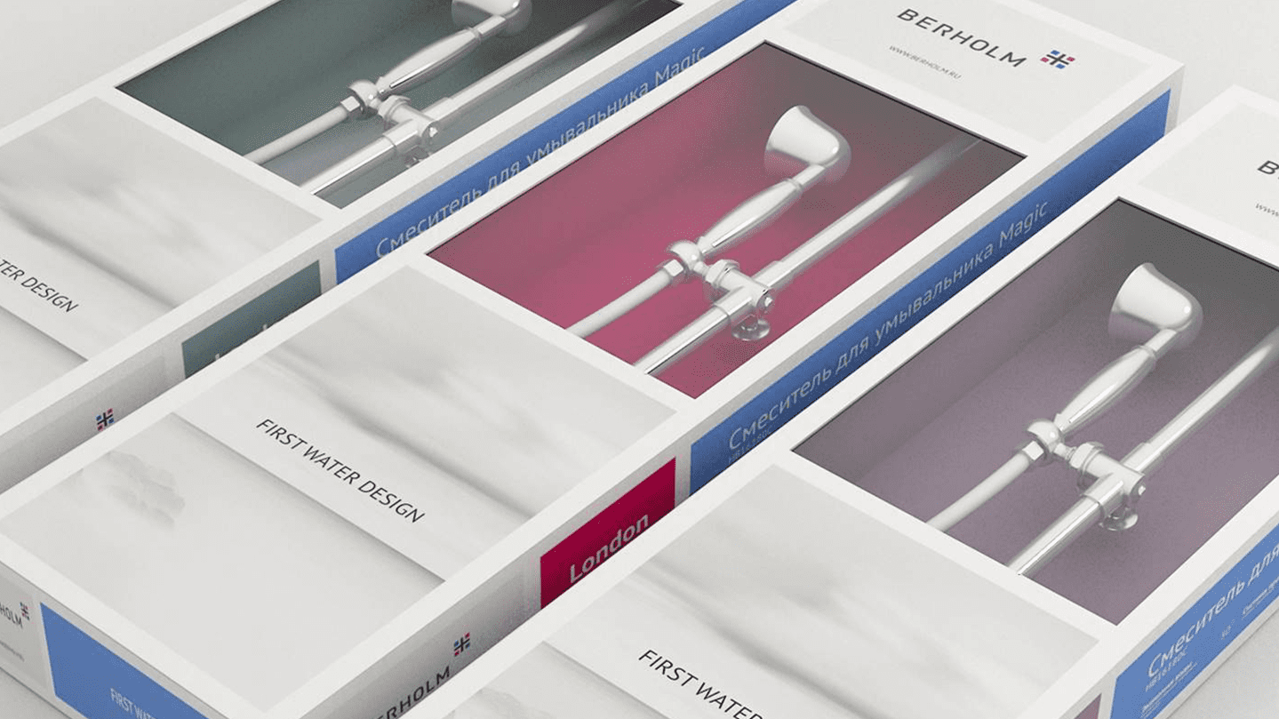
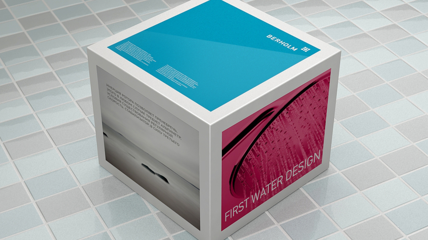
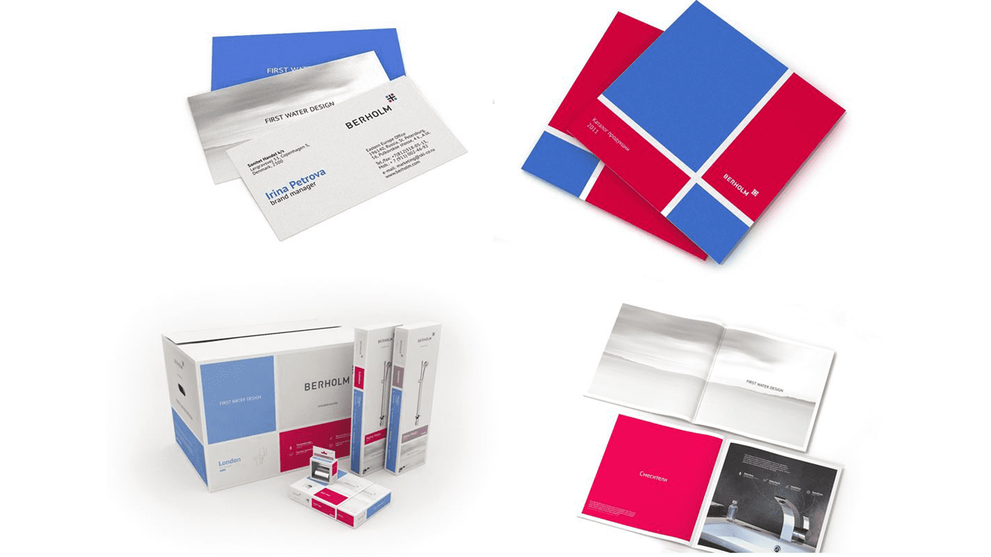
Total Skills task was to develop a brand platform and create an identification system reflecting the key values of the future brand - modernity, technicality and status. The development phase was preceded by a comprehensive analysis of the market and communication strategies of the company's competitors. Total conducted marketing research, developed a brandline, logo, brand style and modern packaging.
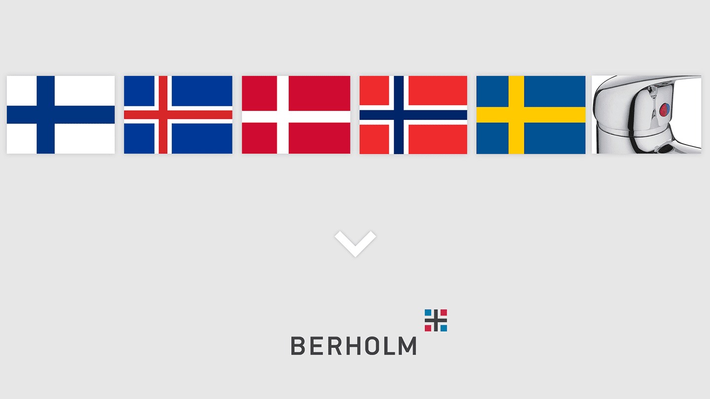
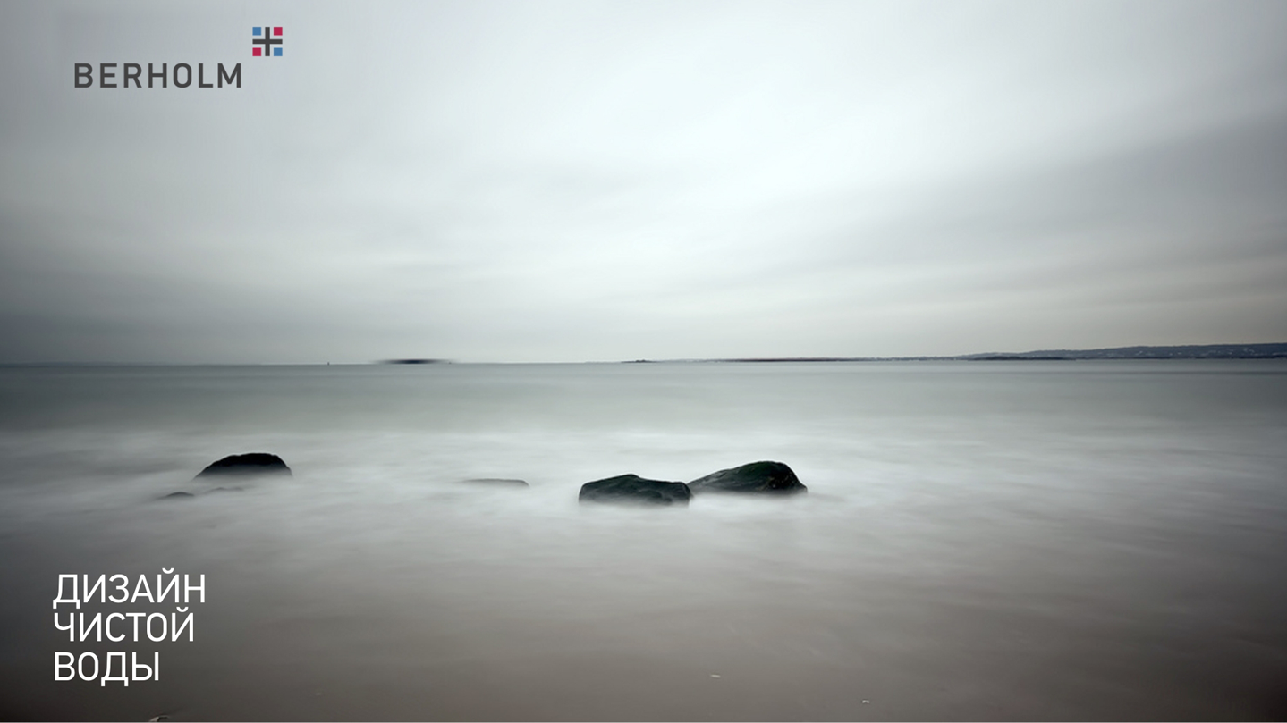
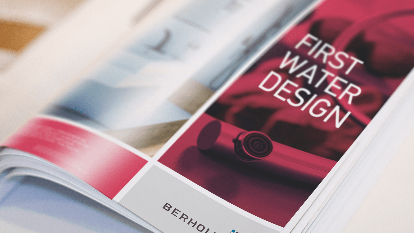
The Berholm logo consists of two parts: the company name and the sign symbolizing the "Scandinavian cross" found on the flags of all Scandinavian countries. Together they form the company’s unique symbolism The agency's proposed brandline, First water design, reflects the outstanding accuracy of the expression of ideas by Scandinavian designers Berholm. It uses the consistent expression "First water", which means "pure water" and is always used when talking about the purity of precious stones. Thus, the Russian-language version of the brandline sounds like the "Clean water design". To strengthen the brand's image and convey its mood, brand images were developed to reflect the rugged beauty of northern latitudes. The agency's concise and strict packaging style for the company's products also resembles a "Nordic cross." Berholm presentation brochure with detailed product descriptions, technologies used and excellent photos. Branded packaging was designed for various types of quality products: Mixer taps, leases, bathroom accessories, etc.
